Fewer colours, better paintings
Limited palettes outperform large ones.
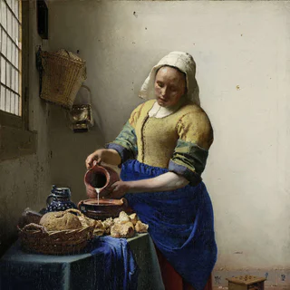
Beginners imagine that more pigments mean more possibilities. The masters knew better. Vermeer's most luminous paintings were made with maybe eight pigments; Velázquez worked with seven or eight; Anders Zorn made his celebrated portraits with four. A small, well-understood palette is more powerful than a large one, because the painter who knows what every mixture will yield is the painter who paints with conviction.
I paint with five or six colours only; the rest is in the eye. Anders Zorn
01The Zorn palette
The Swedish painter Anders Zorn (1860–1920) painted many of his portraits with only four colours: ivory black, yellow ochre, vermilion (or cadmium red light), and lead white.
The palette has no blue, yet the black, mixed with white, behaves as a cool grey-blue and serves wherever a blue is wanted in shadow. The Zorn palette is the best introduction to mixing flesh tones for a beginner — you can't get into trouble with it because there's so little to confuse you.
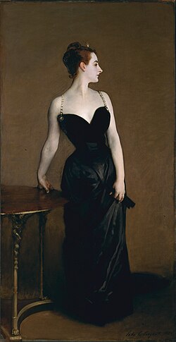
Sargent · Madame X · 1884 · an extended Zorn-type palette
02The earth palette
An extension of the Zorn used by Rembrandt and most of the seventeenth-century Northern masters. Adds the earths and a single cool: burnt sienna, burnt umber, raw umber, and ultramarine blue. With these you can paint anything — not anything that exists, but anything in the kind of dim, warm, candle-lit world the Northern masters favoured. This is the most generally useful palette in the classical tradition.
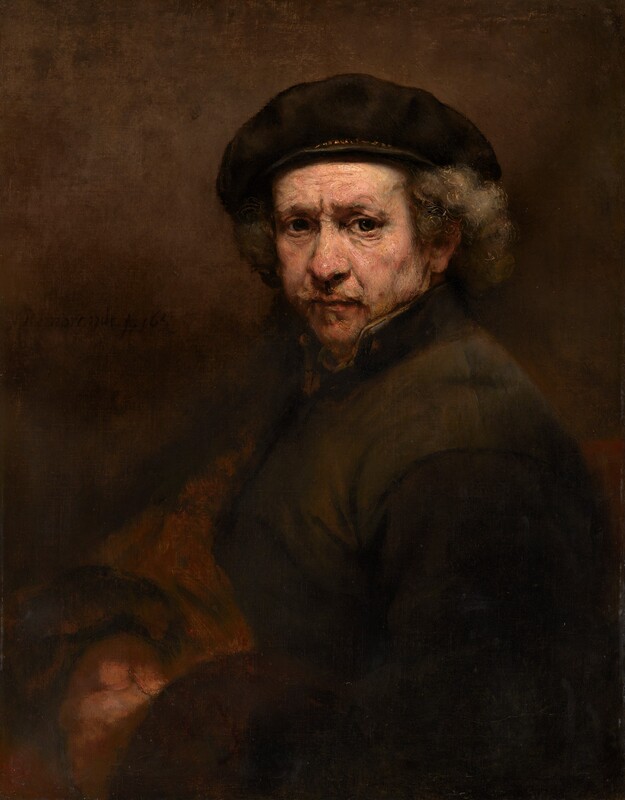
Rembrandt van Rijn
Self-Portrait

Caravaggio
The Calling of Saint Matthew
03The full classical palette
For brighter outdoor work and more saturated subjects, add: cadmium yellow light, cadmium yellow medium, alizarin crimson, viridian, and cerulean blue. A palette of great range, but it takes discipline to use without becoming garish. Reserve the high-chroma cadmiums and the alizarin for accents; let the earths do most of the work.
A useful rule
One warm and one cool of each primary. Warm yellow (cadmium) and cool yellow (lemon); warm red (cadmium) and cool red (alizarin); warm blue (ultramarine) and cool blue (cerulean). With these six you can mix nearly any colour in nature. The earths and black are then luxuries — useful luxuries, but luxuries.
04The three dimensions of colour
Every colour has three independent qualities. The painter who understands them can speak about mixtures with precision. They're codified in the Munsell system, taught in every serious atelier:
Value
Lightness or darkness, on a scale from black (0) to white (10). The most important of the three. Most beginners' colour errors are in fact value errors.
Hue
The colour family: red, yellow, blue. Easiest to identify, but least often the source of trouble.
Chroma
Saturation or intensity, from neutral grey (0) to vivid pigment (15+). A mature painter manages chroma constantly. The beginner usually paints everything too saturated.
05Mixing flesh tones
The flesh is your hardest problem because you know it best by eye and can't fool. Three principles:
Flesh is not pink
Healthy flesh in ordinary studio light has roughly the value of a brown paper bag — far darker than beginners imagine. Mix the value first by eye, then worry about colour.
Decide your light source
A warm source (incandescent, sunset, candlelight) gives warm lights and cool shadows. A cool source (north window, overcast) gives cool lights and warm shadows. Both are true. Decide which you have and commit.
Three values, three temperatures
Mix in advance: three light-family values (highlight, halftone, transition) and three shadow-family values (shadow body, reflected light, deepest accent), each with a deliberate warm or cool cast. Then paint the head only from these six puddles. You'll learn that flesh is built from very few colours indeed.
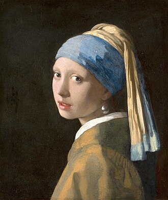
Vermeer · Girl with a Pearl Earring · c. 1665 · cool light, warm shadows on the cheek
06Warm & cool
The most important concept after value is temperature. A red can be warm (cadmium, leaning orange) or cool (alizarin, leaning purple). A white can be warm (titanium tinted with yellow ochre) or cool (titanium tinted with ivory black, which appears blue at high values).
The classical painter is forever asking, warmer or cooler than what? — comparing each new mixture not to an abstract idea of warmth, but to its neighbour on the canvas. Local accuracy of temperature, more than hue, is what gives a painting its sense of life.
Get the value, the colour will follow. Get the temperature, the form will turn. Get the edge, and the painting will live. Frank Reilly
The limited-palette month
Spend a month painting only with the Zorn palette. Paint a head, an apple, a fold of white cloth, a brass bowl, a green leaf. You'll discover you can paint nearly anything with four colours, and you'll learn more about colour mixing in that month than in a year working with twenty tubes.